QueRicaVida

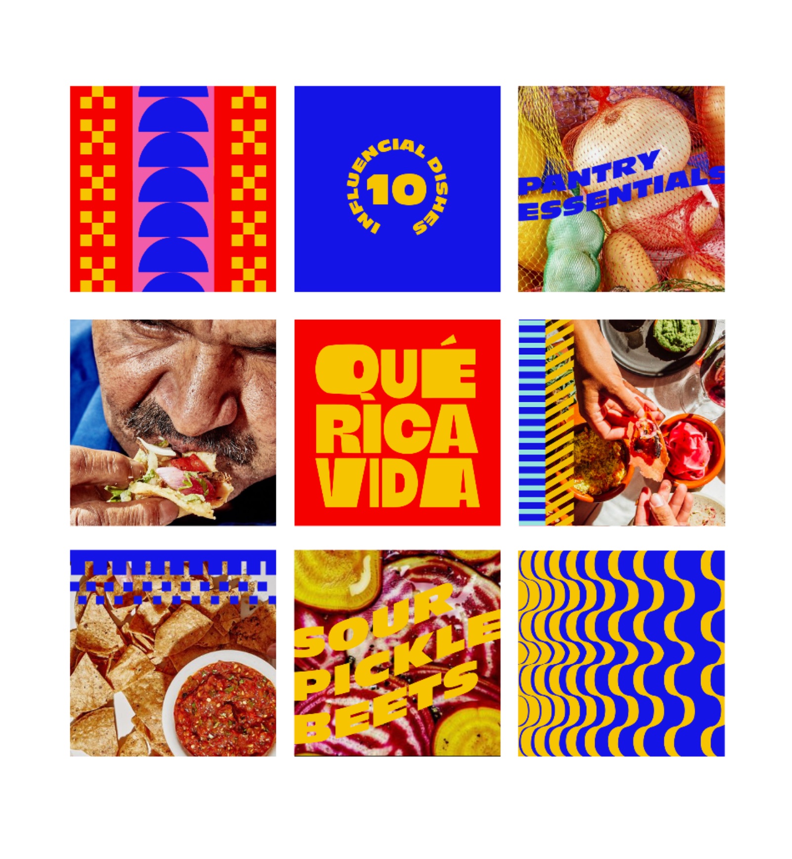
QueRicaVida is a General Mills website focused on Latin American meals and culture. The rebrand was deeply rooted in Latin energy, drawing inspiration from traditional colors and patterns that evoke vibrancy and heritage. The new color palette features bright yellows, lively blues, and playful pinks, creating an energetic and inviting visual identity — complemented by expressive typography, layered collage elements, and an illustration style reminiscent of handwritten recipes passed down through generations.
CreditPearlfisher
Creative DirectorDrew Stocker
ContributionCreated Concept 1 / Contributed to Concept 2
TypeBrand Identity / Web Design
I created the first concept and aided in the design of the second. Both directions were developed to capture the vibrant energy of the Latin spirit, drawing inspiration from traditional Latin elements and bold, impactful flavors.
Concept 1
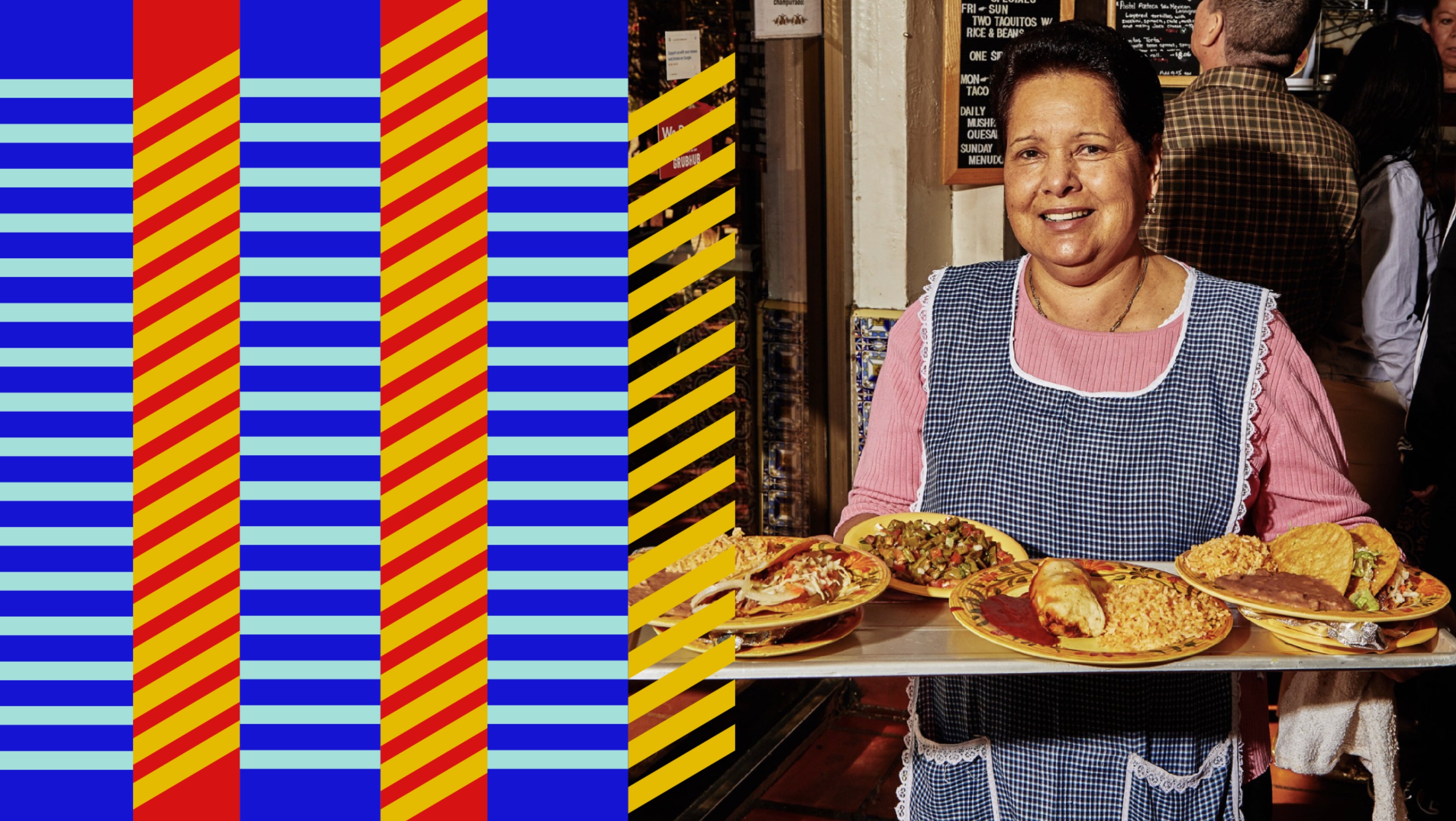
Qué Rica Vida — woman serving plates next to patterned stripes
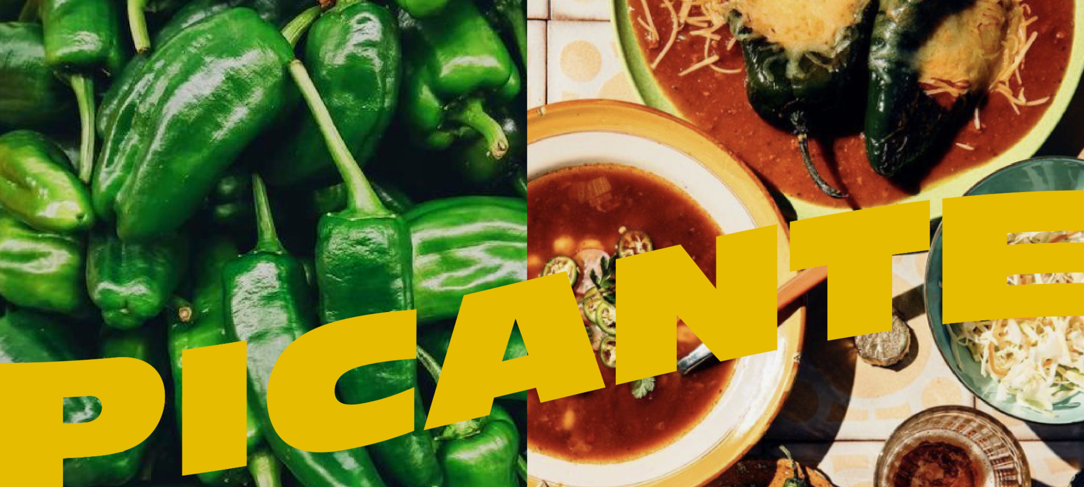
Qué Rica Vida — Picante typography over peppers and food photography
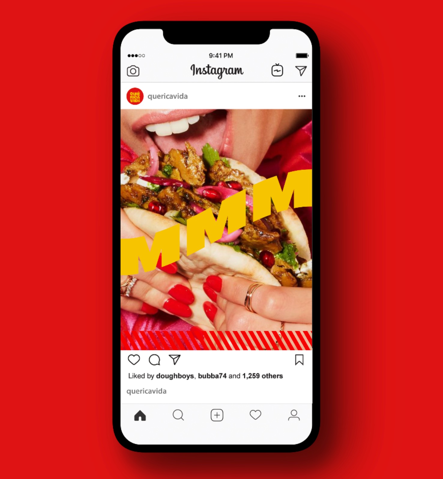
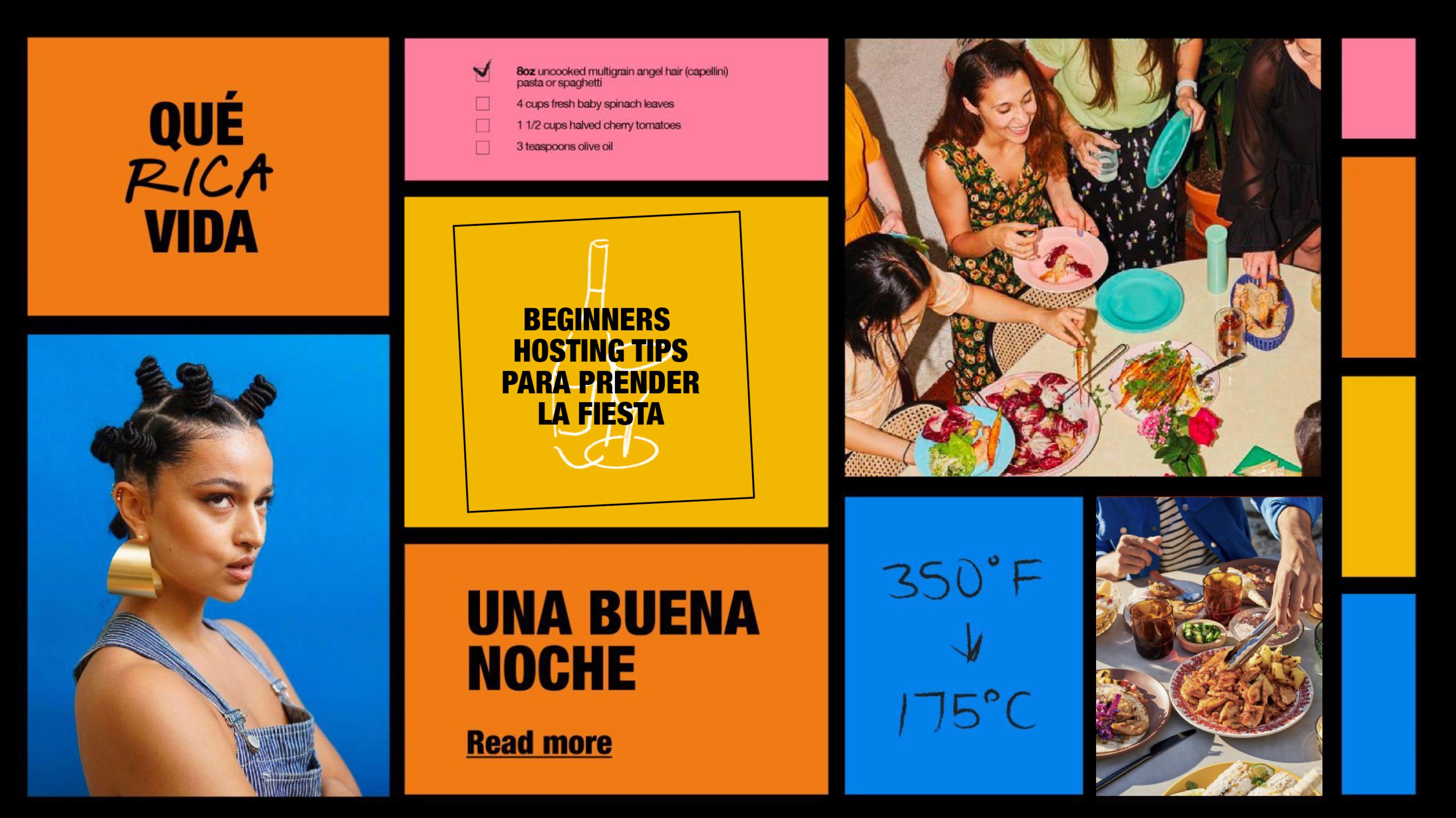
Qué Rica Vida — social tile grid featuring patterns, food, and editorial tiles Qué Rica Vida — Instagram feed mockup with MMM typography over food photo
Concept 2
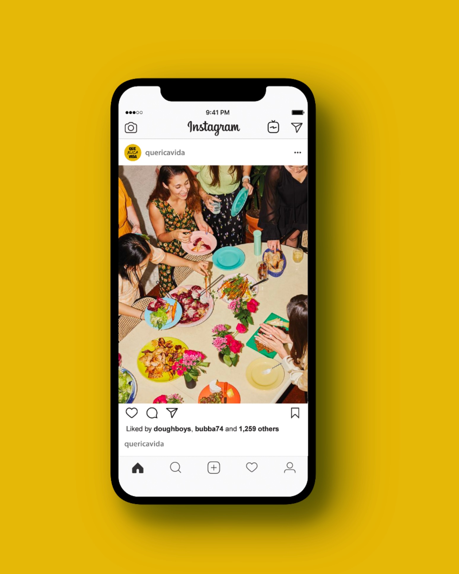
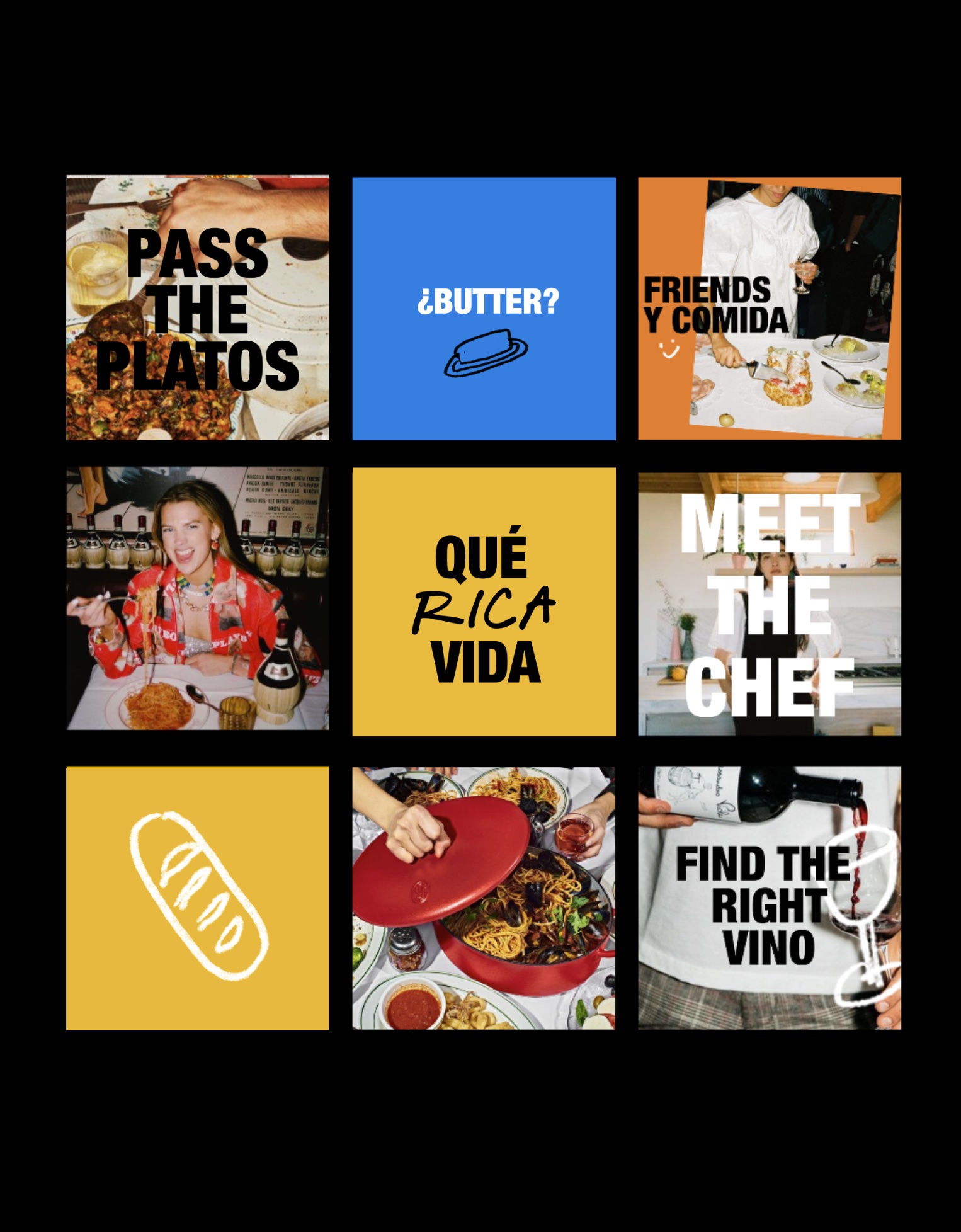
Qué Rica Vida — Instagram post of overhead dinner party spread Qué Rica Vida — 9-tile social grid with editorial captions and food photography
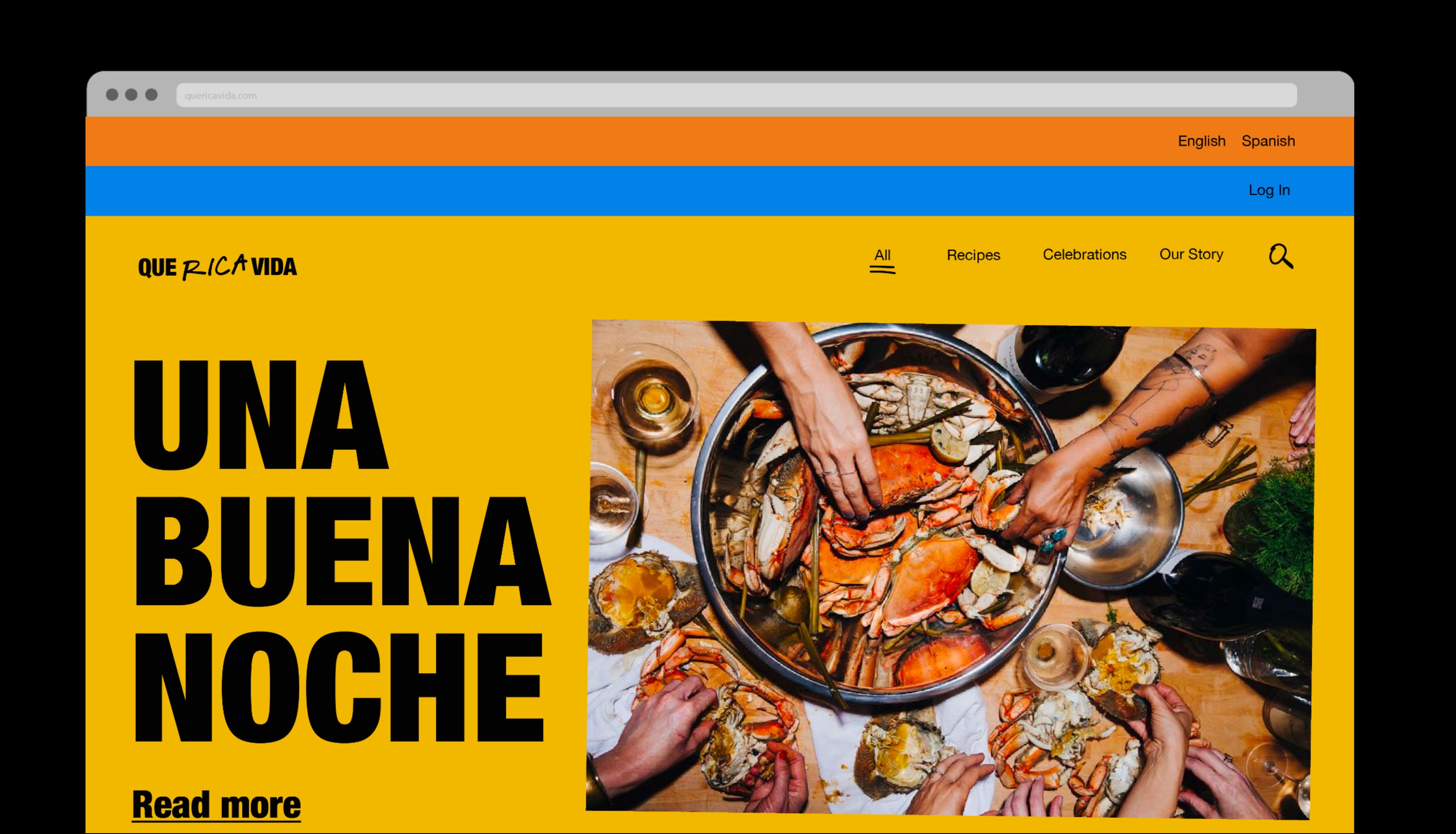
Qué Rica Vida — Una Buena Noche homepage with crab feast photography
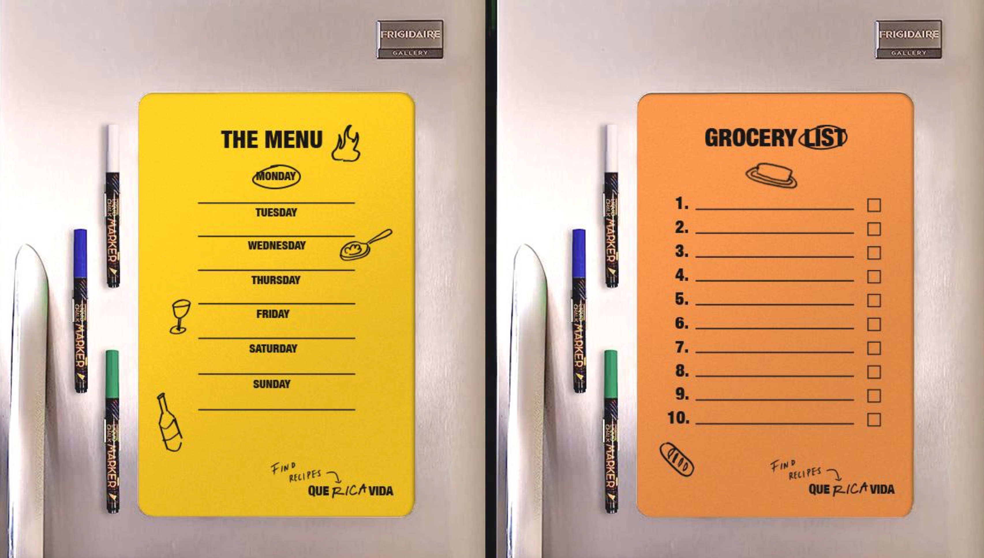
Qué Rica Vida — fridge-mounted weekly menu and grocery list pads
Qué Rica Vida — editorial collage spread with recipes, portraits, and lifestyle photography
Final Work
QueRicaVida homepage

A celebration of Latin American culture with authenticity, energy, and a touch of tradition — making the culinary experience both engaging and memorable.


QueRicaVida responsive logo
Brand elements
Web UI Food truck
Web screens
All Projects