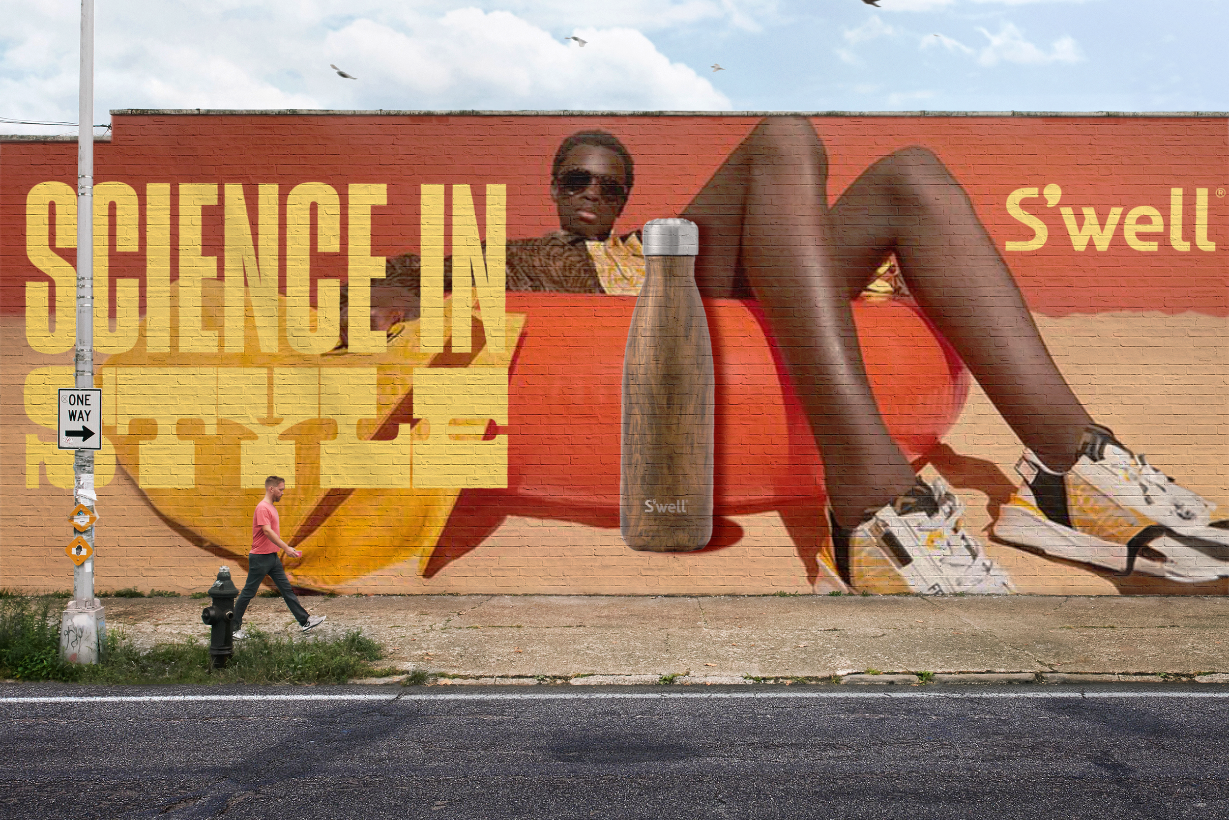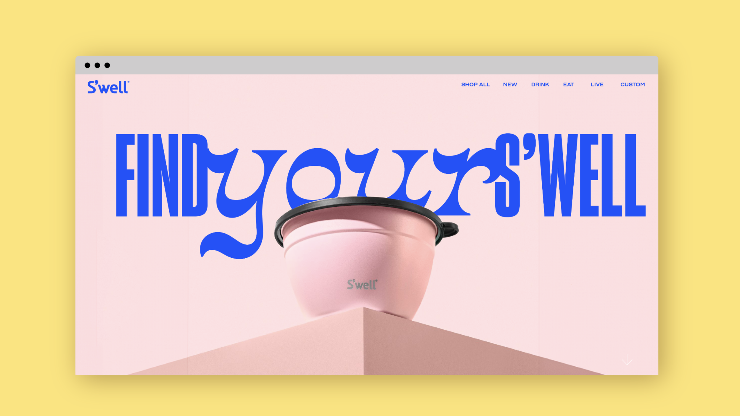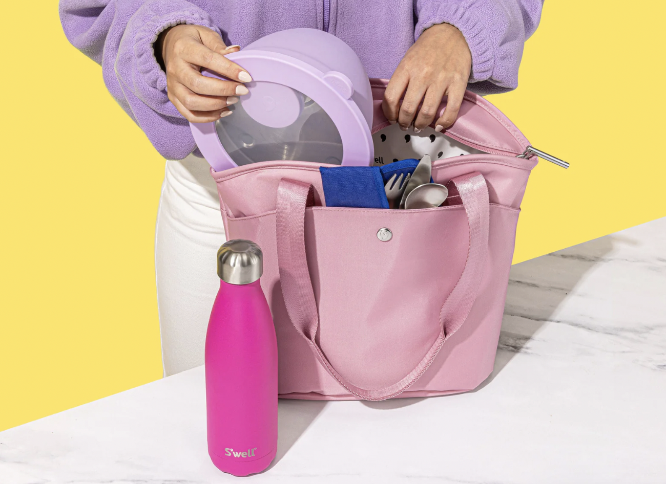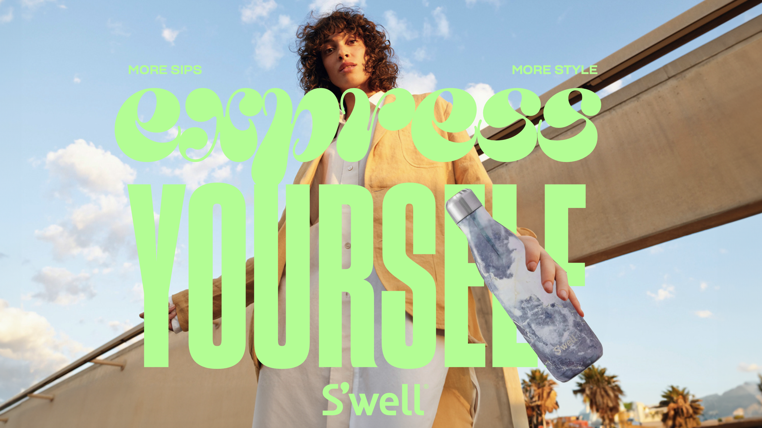
With changing market dynamics, S'well needed to develop an ownable positioning and a revitalized creative approach that would drive category distinction while connecting with an evolving target audience. The refreshed visual system features a bright color palette and expressive typefaces that put consumers' personalities front and center. Updated brand typography introduces more character and playfulness, adding depth and texture to verbal communications and campaign materials.
A refreshed visual system with a bright color palette and expressive typefaces that put consumers' personalities front and center — contrasting with competitors who rely on limited-time offerings to drive self-expression.